Wednesday, 30 November 2011

I have been watching a lot of films lately. In the past few months I've probably doubled the amount of films I've watched and trebled the quality. I'm always drawn in by a fantasticly tragic and interesting script. I'm not too thrilled with happy endings. I like cliffhangers, stories with ambiguous meanings and films that are quite thought provoking. Above all I love the cinematography. Here are a few films that I've seen this year which stood out to me (in terms of the cinematography and editing.)


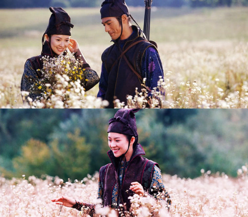
House of Flying Daggers, 2004. Directed by Yimou Zhang.
All of Zhang's films are visually stunning but this was the first of his films that I saw. Each scene tends to be themed around a colour (in costume and settings) and reflect the mood of the scene... the traditional chinese clothing is probably the most impressive thing but every detail in all aspects of this film has had so much attention.


Manhattan, 1979. Directed by Woody Allen.
The second Woody Allen film I saw. It was shot in black and white with an amazing montage of the Manhattan skyline at the beginning. The rest of the film features Manhattan heavily and contains the iconic bridge shot (above) filmed at 5am.

http://24.media.tumblr.com/tumblr_luud7eFqtZ1qdwclpo2_500.jpg  
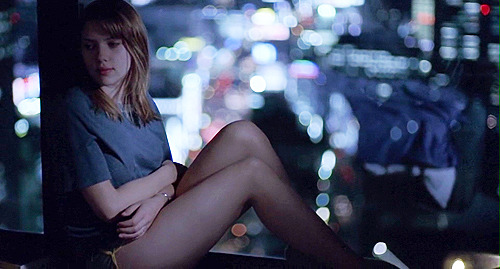
Lost in Translation, 2003. Directed by Sofia Coppola.
Filmed in Tokyo, lots night life and narrow depth of field to show off the lights and bokeh. It's so beautiful.

http://www.somniumxxx.biz/br_screencap/taxi_driver/small/01.jpg 

Taxi Driver, 1976. Directed by Martin Scorsese.
I don't know why I like like Taxi Driver so much visually... there are wonderful shots of De Niro driving his taxi through NY at night, but I think more than anything it offers a very different view of the city. A much darker and dangerous side which is very contrasting to Manhattan, for example. 
   

Deconstructing Harry, 1997. Directed by Woody Allen.
I have to include another Woody Allen film because I watched this very recently and I really liked the editing. Allen plays a writer and the film really consists of flashbacks and scenes from his stories as they overlap with his life; his characters start interacting with him.  There is a surreal scene where he comes out of a lift (pictured) into hell. In the film when his life is going well the scene plays out, but when he has arguments or sees his analyst, the scene is full of jump cuts. At the beginning of the film, a scene is heavily edited with jump cuts and repeated numerous times. It's a really stand out film compared to some of Allen's other films.
http://27.media.tumblr.com/tumblr_ks32zi3zTA1qz9qooo1_500.jpg 

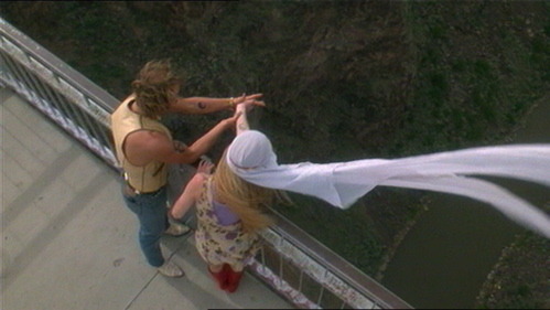
Natural Born Killers, 1994. Directed by Oliver Stone.
Honestly the weirdest film I've ever seen. There is so much editing and so many methods used. I read that the film took 56 days to shoot while editing took 11 months. There are almost 3000 cuts in the film while the average film apparently has about 600-700. It's frenzied... it's filmed in black and white, colour (unusual colour schemes), animation is used, as well as a range of camera angles, special effects and filters. Despite it's controversies, there's no denying it is a very interesting and creative film.

Thursday, 24 November 2011

The Beautiful: Illustrations for Fashion and Style

There are very few things that I see that I instantly fall in love with and become so jealous about but I found the beautiful lying around in college and it's just the most stunning book I have ever seen. I need to buy it: I have quite a few photography books because I am so much more inspired by photographers than painters or designers. This is the first non photography related book I have seen that I'm really enthusiastic about.


There are so many styles in this book but all absolutely stunning. I've tried to start drawing more illustrative over the last few months and I would be so happy if I could just draw like this for the rest of my life. It's just a style of drawing that really appeals to me and it can be applied to almost anything.

Wednesday, 23 November 2011

I had my third life drawing class today and I think I produced some of my best work (despite the fact that the poses were the hardest I've ever had to draw). I love drawing portraits but I never tried life drawing until I started art foundation. It's really challenging since you just get thrown into it but I have noticed an improvement every week, and my proportions and nowhere near as bad as I thought they'd be. It's such a rewarding experience

Soft pastels (30 minutes)
Oil pastels (15 minutes)

Tuesday, 22 November 2011


Well worth watching this video from start to finish. Watch how this painting comes to life, it's beautiful and a little bit mind blowing.

Monday, 21 November 2011

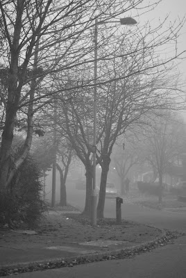
It's days like this when I realise how much I love photography. I went to visit my grandma in Bradford today and it was so foggy, I just went for a walk round the streets and up to the woods nearby to take some photos. Quite spectacular. We don't really get fog that lasts this long round here.


(all photos are unedited because i'm lazy and they are taken on ISO 800 or 1600 because it was so dark but i like the grain)


Wednesday, 9 November 2011

I have never been interested or really connected with painting because I always seemed to view it the way I view how I draw; in realism and literal representation, quite graphic. I've never learnt how to properly use paints in that way although I'm making some progress in oils... Last week, the final project in the diagnostic stage, I had to use the studio space around me to create a painting using acrylic and varnish.

I used parts of the cardboard box that I hadn't used for my conceptual art piece and I used an unconvential dimension. None of this was painted with a brush, all applied and mixed with strips of cardboard, dragging the paint and making single prints with the edge. I based my painting off the doors into the studios, the angular edges and the mesh in the windows. All my lines were horizontal or vertical and  I used masking tape in the last layers to create geometric shapes representing the sections in the window. I'd painting in mostly white and purple (adding yellow to compliment the purple) and I decided to mix a layer of green just to see what would happen and break a few conventions of what is 'harmonious' and 'complimentary'.

Monday, 7 November 2011

I have a backlog of work to put on this blog! I've just finished the last two weeks of the diagnostic stage of my course, the projects being paper and painting. I've enjoyed them about 10 times more than I thought I would.
The paper proje
ct has opened so many doors to me that I didn't know existed. Last week, I was inspired by Su Blackwell to create a set coming out of a book, based on the book itself.  I used The Lion, Witch and the Wardrobe and created a snowy Narnia scene.


Photography played a very important part for this proje
ct to make the scene look more authentic and to distort the scale. I love the intricacy and patience involved with creating something like this. I'd love to create something bigger and better using more dramatic lighting when choosing my extension task.